Visuals and Multimedia are always rhetorical because they always have a purpose whether it be visible or not. Foss, Foss, and Trapp define rhetoric as communication. In our tech savvy society rhetoric as visuals can be anywhere from a presidential candidate's image to the scandal sheet magazines one almost always sees in shops. The rhetorical messages can be as simple as buy a product and be as beautiful as the woman in the advertisement or this candidate is the one to vote for because they support families.
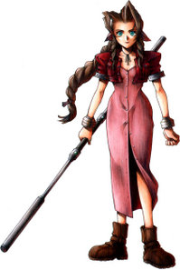
An interesting example of rhetorical meaning in visuals/Multimedia can be found in gaming, most prominently in job class and design and color a character wears. A White Mage, which is usually female (but not always) and what they wear influences how they are perceived: everything from their personality to the way fans view them. Besides practicing benign white magic, they usually generally dress in robes and heals injured characters with a staff. However, in many cases, these characters have a serious flaw in design as producers propose what in gaming is called the quiet "damsel in distress" heroine who must wait for their love interest to come come and rescue them, heal people and don't serve much more of a purpose than these "feminine traits", which is why it can be argued that female characters in games are entirely male dominated and male defined and are by and for male gamers. (In many cases female gamers hate female characters more for their characterizations than how they are dressed) Male protagonists are usually of the warrior class and aren't defined by their relationships with the heroines.
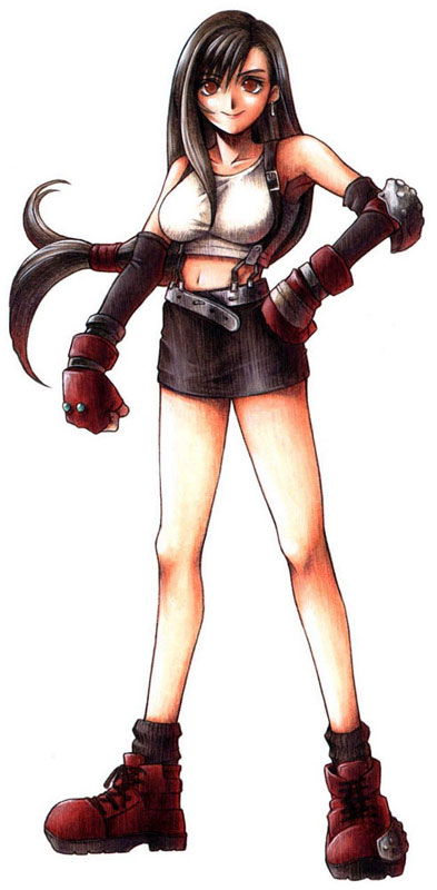
In addition to job class, visual rhetoric is very prominent in a characters game design and the color they wear. I play a Japanese game series called Final Fantasy, and color defines a character's story. White/black are in general reserved for characters in mourning, red/pink is what heroines wear and symbolize love and passion for a cause (these heroines are usually happy go lucky character tropes), blue is usually reversed for heros being the opposite of red and silver hair is reserved for villains. Character design is rhetoric to a gamer cause it not only governs personality, jobs and history but a character's legacy. Now a famous example of this is from a FFVII heroine named Tifa. Although she is a shy, quiet, martial artist and a member of a group saving her world, she is most well known among all 12 games for how much "slutty" her design is than anything else and her character is demonized for it even 12 years after the game was released which goes to show how powerful visual rhetoric really is. This is also unfortunately one of the hotly debated issues on all of my forums.


 Visuals Make Arguments through emotional appeals to the viewer. Visual arguments are sometimes overtly political as shown in this image from the 1968 Olympics in Mexico. This image is immediately recognizable to the viewer as it is one rare instance of visual political rhetoric. Tommy Smith and John Carlos deserve their place in our history as true symbols of Black Power. An important detail that is frequently overlooked was what the two athletes wore during the awards ceremony: “Both were shoeless, but wearing black socks, to represent black poverty. Smith wore a black scarf around his neck to represent black pride. Carlos had his tracksuit top unzipped to show solidarity with all blue collar workers in the U.S. and wore a necklace of beads which he described ‘were for those individuals that were lynched, or killed and that no-one said a prayer for, that were hung and tarred. It was for those thrown off the side of the boats in the middle passage’” (1968 Black Power Salute, Wikipedia). The details of this photo are what matter, and a close analysis and reading of these details will reveal the power and significance of this transformational image. Both Tommy and John are looking down during the playing of the national anthem. They were not looking at the flag that represents their oppression; they were not assenting to the American system that disrespected them. They were showing the flag symbol and the anthem symbol what disrespect looks and feels like. They showed whites how routine white pride looks to black people. When the Black Power salute occurred, it really shook up the sporting world because everyone who was watching saw the silent protest for civil rights in an international sports setting that is supposed to forget about social and racial justice. It put racism on trial for all to see. That is why I have such a powerful connection to this image. It was the light in the darkness that showed white people what was really happening in the United States: the separate but unequal status for black people that was being put in front of white people’s eyes because only a dramatic act, only an outcry, would have a chance of being noticed.