Wednesday, November 4, 2009
Find an image where the form and content conflict and discuss.
 What is wrong with this image? Besides the blatant sexism and rhetorical fallacies used to sell the product we know as Lysol, this ad uses the CRAP Principles fairly well but color is one piece that conflicts with the text. Since everything is black and white, it diminishes the contrast between text and image. The alignment appears to be fairly accurate and their is certainly repetition involved (talking about how great Lysol works), and proximity of the texts and images is also seem to well put together. When I saw the image, I expected to find before and after pictures of the woman like most ads have now. These images would not only attract the viewer but add sorely needed contrast as well as to get the viewer to buy the product in hopes of improving their marriage.
The main flaw in this image is it's argument. The idea that the image sends to the reader blames women and their sexuality for happiness disappearing in a marriage to sell Lysol? Is it just me or is that preposterous. Seriously, Lysol is not something I would want to touch and definitely not to use in place of soap as its purpose is to clean and purify surfaces. Not to mention their is no place on the ad that gives any scientific argument to tell the customer how much to use and verify that Lysol won't hurt women. To make matters worse, there is no place on the ad where there were studies done and that doctors approve the product for human use.
The three locks that dominate the top image are important because they portray a desperately weak, ignorant, woman that is filled with doubt, completely dependent on her husband and looks for a magic cure "Lysol" to get his love back and "unlock" the door to him. It reminds me or damsel in distress tales only much more overtly sexist. I'm not too surprised by the portrayal of the woman as the ad appears to be from 1950s but the ideology is dangerously patriarchal. For all we know, the husband may be cheating (which would also cause neglect) your guess is as good as much, but the promotion of simple-minded woman is completely centered around serving her man's needs is an outdated insult and just make every reader outraged at the portrayal of housewives.
Monday, October 26, 2009
Why do you think the CRAP Principles are important in design?
The Crap Principles of Contrast, Alignment, Proximity, and Repetition are important to design because it can enhance or expose a poorly designed image. They may seem to be unimportant and trivial, but Williams gives names to four techniques that are most commonly used and seen on websites, magazines, comics and almost any type of visual image. Most people use all 4 without knowledge that their is a named design principle but rather for effect.
Proximity on websites is grouping related items together (which is also what people do intuitively and look for) is always important as it helps direct the guide the reader. For example if a website centered about flowers had a link around say maybe characters in a game or book that would be immediately obvious that it doesn't belong. The text example of an ad for dancing styles also shows the importance of clear communication of ideas (we might laugh at this and say its obvious) but we can always identify a poor website from a professional one with ease. Looking at say the Menu differences in the text for the Piano Bar, my mind immediately identified the extra space of the second image to be more appealing in terms of understandability, alignment, and logical organizational relationship and also one I would I like to perhaps receive if I had indeed gone there.
Alignment seems pretty self-explanatory but it often a violated rule in website design to varying degrees mostly because it is hard to spot unless done intentionally (Williams mentions this in changes in text alignment which are a no-no if not done intentionally and not desired done more than once.) Williams also reminds us that designers can't simply place text and graphics any where with no care of the arrangement and see if they stick. In the numerous examples she gives she encourages new designers to see alignment as order which our eyes are programmed to see. She also wants the reader to balance being bold (messing with font alignment of not centering every document) with being readable. She mentions that a well designed document should be able to draw lines between the objects.
Repetition is often used by designers to may a point, however if used too much or incorrectly it defeats the purpose of highlighting important information for the audience. Repetition also has the purpose of adding visual interest to grab a reader such as the two examples of the Mermaid Tavern. The second improved business card immediately grabs the reader with bold print and ties the piece together as Williams notes. For lack of a better comparison repetition is like makeup. It accentuates your face but adding too much spoils the contrast and the focus of accentuating one's facial features. This is very important in both print and visuals and is the easiest to identify if done poorly.
Contrast is often used by designers to draw readers into an image or website page. Color is perhaps the most frequent and effective method that I have seen and used although differences in font size are also used (although I have seen them used more in flyers and ads than websites). The type face contrasts have a great use in website headers and I have been more inclined to visit a site with an exciting banner rather than just the usual header (with a photoshopped picture and text). For the text example of the rules of life, while they were all clear, clean and neat the last picture immediately grabbed my attention because of the white on black text. The only danger in using contrast is misusing it will backfire as the audience will not be drawn into your website/magazine/photo etc but rather out. I have seen this happen with poor contrasted colors or repetition of contrast colors but most times common sense will take care of contrast issues as it connects you with the audience. (In website terms it's like your face to the audience and sometimes tells more about a designer than a personal website based on their choices of contrast.)
After reading the two McCloud pieces, how do you think McCloud views comics as visually rhetorical?
I found McCloud's two comics to be very witty and impressive that he is able to make a case for the inclusion of comics into visual rhetoric. The strip about the contrast between image and print was especially enlightening.
Monday, September 28, 2009
Can Visuals Make Arguments? How do Visuals Make Arguments?
 Visuals Make Arguments through emotional appeals to the viewer. Visual arguments are sometimes overtly political as shown in this image from the 1968 Olympics in Mexico. This image is immediately recognizable to the viewer as it is one rare instance of visual political rhetoric. Tommy Smith and John Carlos deserve their place in our history as true symbols of Black Power. An important detail that is frequently overlooked was what the two athletes wore during the awards ceremony: “Both were shoeless, but wearing black socks, to represent black poverty. Smith wore a black scarf around his neck to represent black pride. Carlos had his tracksuit top unzipped to show solidarity with all blue collar workers in the U.S. and wore a necklace of beads which he described ‘were for those individuals that were lynched, or killed and that no-one said a prayer for, that were hung and tarred. It was for those thrown off the side of the boats in the middle passage’” (1968 Black Power Salute, Wikipedia). The details of this photo are what matter, and a close analysis and reading of these details will reveal the power and significance of this transformational image. Both Tommy and John are looking down during the playing of the national anthem. They were not looking at the flag that represents their oppression; they were not assenting to the American system that disrespected them. They were showing the flag symbol and the anthem symbol what disrespect looks and feels like. They showed whites how routine white pride looks to black people. When the Black Power salute occurred, it really shook up the sporting world because everyone who was watching saw the silent protest for civil rights in an international sports setting that is supposed to forget about social and racial justice. It put racism on trial for all to see. That is why I have such a powerful connection to this image. It was the light in the darkness that showed white people what was really happening in the United States: the separate but unequal status for black people that was being put in front of white people’s eyes because only a dramatic act, only an outcry, would have a chance of being noticed.
Monday, September 21, 2009
Apple logo and its qualities as a Picture, Symbol and Sign
As a picture, Apple's very simple. The very first logo was Issac Newton under an apple tree which was a brilliant rhetorically move as it connected scientific/computer knowledge and "gave" it to every user of a Mac computer. An interesting fact is that the apple missing a bite has been on every logo since the rainbow colored apple (which was the second ever created and the longest in terms of use at 22 years.)
As a symbol, Apple's logo claims to be presenting a company that doesn't just put money first but appreciates scientific knowledge and history. Issac Newton after all discovered gravity and the separation of light (prism). Wikipedia also mentioned that one theory about the rainbow logo is its connection to the mathematician/computer scientist and one of the fathers of the computer Alan Turing who was gay (and because of this he committed suicide with an apple laced with cyanide). Whether or not that is connected to the change in the logo, it still is a nice dedication.
As a sign, the symbol has been marketed so much that most people will recognize the logo even if they don't have a Mac or Apple product. The logo's sign is also successful in conditioning/branding customers to only buy Apple because of its campaign/competition with Microsoft. Apple targets young adults and hooks them to their products, because of this it has huge followings of supporters. In addition, fewer problems with Macs and other Apple products creates a good rep for them unlike Microsoft's numerous problems with their Windows Products. That alone can reinforce and spread the idea of Apple being the better choice.
Wednesday, September 9, 2009
Rhetorical Organization and Rhetorical "Devices" in terms of a FF forum

The two readings on Synecdoche, Metonymy, and Metaphor are a little confusing, but based on the definitions my object of study -- my FF forum -- uses Metaphor in it's design and color. The color is pink and the banner shows two lovers in a flower field (or did until it was updated on the 1st.) Although not many people like the color pink (it presents a light hearted environment to talk about not just who loves who but almost any subject like in a living room.) Topics vary from the series to politics to help with classes, even venting about one's most hated book series ever. Now I may not know about colors much, but it one of the most essential aspects of a forum because most people decide whether or not to come back based on the environment of the place. While Apple and Microsoft have recognizable symbols and use Metonymy, a forum will most likely employ Synecdoche though posting as all members should contribute to the conversation.
While my forum design uses Metaphor and Synecdoche is it the combination of the two that must be employed to make a good forum which is not too focused on a single idea/topic or one where anything goes as that will not only attract trolls and spam bots. Synecdoche as I understand it is like the body of an html document or C++ computer language which is originally apart of C. Forums which are the most successful/userfriendly will employ the three rhetorical devices together.
Here's the link to my forum: http://s8.invisionfree.com/Cloud_x_Aerith/
Monday, September 7, 2009
How are visuals and multimedia rhetorical?

Visuals and Multimedia are always rhetorical because they always have a purpose whether it be visible or not. Foss, Foss, and Trapp define rhetoric as communication. In our tech savvy society rhetoric as visuals can be anywhere from a presidential candidate's image to the scandal sheet magazines one almost always sees in shops. The rhetorical messages can be as simple as buy a product and be as beautiful as the woman in the advertisement or this candidate is the one to vote for because they support families.
An interesting example of rhetorical meaning in visuals/Multimedia can be found in gaming, most prominently in job class and design and color a character wears. A White Mage, which is usually female (but not always) and what they wear influences how they are perceived: everything from their personality to the way fans view them. Besides practicing benign white magic, they usually generally dress in robes and heals injured characters with a staff. However, in many cases, these characters have a serious flaw in design as producers propose what in gaming is called the quiet "damsel in distress" heroine who must wait for their love interest to come come and rescue them, heal people and don't serve much more of a purpose than these "feminine traits", which is why it can be argued that female characters in games are entirely male dominated and male defined and are by and for male gamers. (In many cases female gamers hate female characters more for their characterizations than how they are dressed) Male protagonists are usually of the warrior class and aren't defined by their relationships with the heroines.
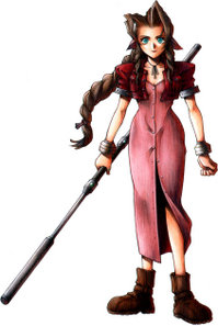
In addition to job class, visual rhetoric is very prominent in a characters game design and the color they wear. I play a Japanese game series called Final Fantasy, and color defines a character's story. White/black are in general reserved for characters in mourning, red/pink is what heroines wear and symbolize love and passion for a cause (these heroines are usually happy go lucky character tropes), blue is usually reversed for heros being the opposite of red and silver hair is reserved for villains. Character design is rhetoric to a gamer cause it not only governs personality, jobs and history but a character's legacy. Now a famous example of this is from a FFVII heroine named Tifa. Although she is a shy, quiet, martial artist and a member of a group saving her world, she is most well known among all 12 games for how much "slutty" her design is than anything else and her character is demonized for it even 12 years after the game was released which goes to show how powerful visual rhetoric really is. This is also unfortunately one of the hotly debated issues on all of my forums.


Monday, August 31, 2009
Transparency and Reflectivity on Gaming Websites
I am a freelance designer of game websites so user interface is of particular importance to me. I tend to make Final Fantasy forums, which are oddly enough a good example of transparency and reflectivity. As most people know a forum is (a conversation) divided in admins and users. Admins are designers because they have to make sure every function that a user touches (say for example a topic in an individual forum) works perfectly and is not broken or requiring HTML code make it more user friendly. If this happens not only is user interface interrupted, but design flaws in the coding can cause users trouble and make them want to migrate to a different forum which is easier to use. (An unfortunate example of a breech in transparency occurred when a user tried to paste a topic in a language other than English and it showed up as nonsensical code instead). This breech ended up with me painstaking teaching my users how to use HTML code to input language. This turned into a mess (essentially because every character required a different HTML code) and caused me to use another forum language all together with was a serious design flaw. As a designer/admin, I am not only responsible for making sure a task or application doesn't make the user focus on it rather than enjoy the posted conversation. Although I didn't code the forum software myself, (I rather got it for free), I am in a unique position because I am both the user and designer. (Using the analogy of transparency as looking though a window from the text, I can see both sides clearly as I am always both.
Reflectivity is the other component of digital design that is tied with transparency as it is the artistic imagery on a website that well either attract users or not. Admins with experience will usually change forum images or colors to keep users coming back, addition of different music or simply making interface connect more to the user and their surroundings to keep them coming back.
Reflectivity is the other component of digital design that is tied with transparency as it is the artistic imagery on a website that well either attract users or not. Admins with experience will usually change forum images or colors to keep users coming back, addition of different music or simply making interface connect more to the user and their surroundings to keep them coming back.
Thursday, August 27, 2009
WSU's Views of Multimedia authoring
In my experience at WSU, I've observed that while teachers may use powerpoint in their teaching, they generally shy away from requiring anything remotely "technology" in their assignments. For example, I only learned how to use powerpoint because that was all I ever needed to be able to use. Some people may argue that Multimedia doesn't need to be in any class beyond the DTC major and perhaps some computer science courses. However, this may be related to the fact that few teachers know how to grade "Multimedia projects" because they are graded on the end product and unless there is a rigid grading scale, everyone can get an A if they have flashy text or use more "technology" than content. Unfortunately, this happens in more classes than I'd like it to. As for technology in the rhetorical writing major, it has by no means given enough attention to. This may be related to the fact that digital rhetoric is a relatively new field and needs to earn more ethos.
In any case, WSU teachers and admins need to come to terms with the fact that technology will always exist in some form of another and that people can either ignore it completely (which is highly unlikely) or become its slave (as so many people that can't stop text messaging appear to be.) Probably the best solution is hybrid teaching of Visual/Digital Rhetoric and Verbal Rhetoric (which is what we usually think of when English is mentioned) that Kress and Stroupe advocate.
In any case, WSU teachers and admins need to come to terms with the fact that technology will always exist in some form of another and that people can either ignore it completely (which is highly unlikely) or become its slave (as so many people that can't stop text messaging appear to be.) Probably the best solution is hybrid teaching of Visual/Digital Rhetoric and Verbal Rhetoric (which is what we usually think of when English is mentioned) that Kress and Stroupe advocate.
Subscribe to:
Posts (Atom)